Why Are Logos Getting Simpler?
April 17, 2023
We’ve all gotten to know (and love) the iconic Mr. Pringles. With his luscious brunette locks, classic bowtie, and glistening eyes, he has gotten us through our countless binge-watches and movie marathons.
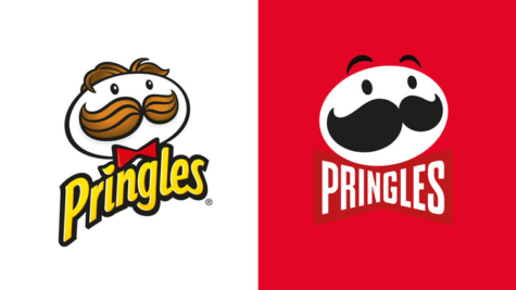
All that changed when Pringles introduced its new logo design in 2021, opting for a more simplistic look. This change received negative reception, with many feeling devastated and distraught. So, why did Pringles decide to make the change despite resistance? More importantly, why are so many companies following this logo oversimplification trend?
Simplifying logos involves removing anything from a logo that is not essential, only keeping the fundamental shapes and elements. This includes removing excess color and dimension. As more companies rebrand to simplify their logos, more follow. According to a study conducted by Harvard Business Review, “around 60% of major companies are now using non-descriptive, oversimplified logos, usually with flat design. Around 40% use a more descriptive logo.”
In today’s world of mobile phones and social media, small screens mean a minimalist logo is more suitable. In addition, a simpler logo makes it easier and cheaper to transfer to other mediums, including clothing, posters, and social media posts. Furthermore, many companies believe that a simplified logo allows consumers to process and remember it with more ease.
Similiar to logo simplification, logo unification is when a company modifies all logos under its brand to be similar in appearance. Take Google, for example. In 2020, they rebranded their Workspace logos to display the same colors and style. Google explained how these new logos represent “a more connected, helpful, and flexible experience,” and the fact that Google’s Workspace apps are “part of the same family”(Source 3). However, due to the logos’ similarities in color and size, many have found it challenging to differentiate between them, making Google application navigation increasingly difficult.
Despite these logical reasons for logo simplification and unification, many logo changes have been met with harsh reactions. Logos are a key aspect of a company’s identity, so when a logo is changed, consumers can feel as if the brand is changing as well. Moreover, many have developed an emotional tie to a specific logo, so altering that logo can instill distress.
I decided to ask my fellow Carver students how they felt about some of these rebrandings via Google Forms. Here’s the catch: I didn’t mention which was the older logo and which was new.
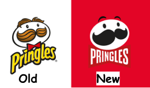
When asked about the Pringles logos, 89.5% preferred the old logo, and 81% said they would be more drawn to it than the new one. The reasoning for this choice includes:
“The brightness of the colors as well as the variation of colors is more appealing rather just only three colors being shown in the second logo. The second one makes it look more generic”
“nostalgic, it’s how i remember it”
While the majority of responses leaned toward a clear preference for the old logo, some were intrigued by the new logo:
“The colorful logo is more iconic and interesting, but the newness of the flat logo makes me curious.”
As for the taco bell logo, the results speak for themselves: 89.5% favored the old logo, and 71% said they would be more attracted to click on it.
Many mentioned how the brighter colors on the older logo were more appealing, eye-catching, and nostalgic.
A minority did prefer the newer logo, though:
“I like the colors of the old one but the text stands out more in the new one”
Maybe you haven’t even noticed Burger King’s logo change, but Burger King hopped on the simplified logo train in 2021. The poll results? Yup, you guessed it! 77% of respondents liked the older logo more overall, and 64% would be more inclined to click on it. Some of the justifications included:
“the burger is more visually interesting and is a good amount of fun for the brand”
“Second one is plain simple and to the point very nice design. Similar to Pringles though I’d probably click the other one because it looks better quality.”
To sum up these results, many agreed that although the newer logos possess a “cleaner” look, the older logos are more appealing because they:
- Bring forth a sense of nostalgia/childhood memories
- Add fun/uniqueness to a brand
- Incorporate numerous eyecatching colors/dimensions
So do the pros of logo simplification and unification outweigh its cons? Many companies have been pressured to rebrand, as they don’t want to fall behind the larger brands that have done so. But judging from a consumer perspective, logo simplification doesn’t usually add much value to a brand. On the contrary, rebranding can reduce trust and support, and without a market to sell to, a company is doomed. Logo preference is a subjective matter, of course, so different target markets will have different thoughts. Personally, I believe that brands should make their own calls regarding rebranding, and proper market analysis is key. So, how do you feel about this marketing trend? Do you think we ought to change the Carver Wildcat logo?